“Things used to be better in the past.” Sounds familiar? While it may be a simple sign of nostalgia, sometimes… it’s just true.
Website designs have improved in many ways over the last couple of decades. For instance, see a blast from the past here if you want to hurt your eyes with some ancient designs that are still online. Although they aren’t the worst (those have been taken down ^^). But not all changes are good, and modern websites tend to increasingly have some UX flaws that barely occurred, if at all, in the past.
Here’s a list of 8 of such annoyances. It’s not a “top 8”, it’s just things I wrote down as I was encountering those flaws. They’re not sorted, not exhaustive, and you’ll see they mostly revolve around login procedures for some reason.
1) The hidden login form
Some websites place an extreme focus on the sign-up form, and neglect/hide/bury the login form. Combined with a tendency to make sign up forms as simple/short as possible, it makes it very easy to get mixed up. These days, I regularly fill sign up forms by accident, when what I meant was to log in. Simply because some stupid UX designer put a 2-field registration form right where you would expect a log in form. And then the form tells me “this account already exists”. Yes, I know, I was trying to log in.
I don’t get the logic in their twisted mind: you only register once, you log in many times, why the hell make it longer to log in than to register?! To me, it signals that they desperately need more registrations… Gladly, it’s still rather rare.
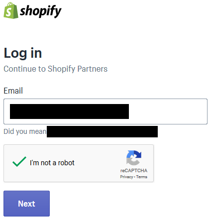
2) The 2-step login form
When I started web development, a good practice, on a failed login attempt, was to show a generic error message like “invalid credentials”, giving the user no indication of whether or not the ID they entered was a valid ID in the first place.
I don’t know what the hell happened, but at some point this commonsense practice became an oddity. And then some morons started to design 2-step login forms like: 1) type your e-mail 2) we tell you if it’s a valid ID, and if so now you type your password. I don’t know who started it all, but the first time I saw that was for the… Gmail login. Kudos, Google!
When this was introduced, I remember a bunch of discussion on IT/dev forums, basically all agreeing that this was not just silly, but a security issue. With such a system, typically you can check if e-mail address X@Y.Z is a registered user on site shitdesign.com. Random example: imagine if Pornhub did that? (NB: I just had a look, they don’t*)
Some websites have thought about that. But they tried to be smart: instead of reverting back to the good, old-fashioned way to do a login form, they had the genius idea to keep the 2 steps and add… a CAPTCHA! And not just one, but 2: one after entering your ID, then another one after entering your password. Isn’t that brilliant? What did you say? You can’t believe people can be that stupid? Well, believe me now:
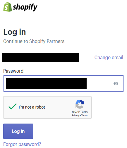
Oh and although it prevents massively checking if a list of e-mails have an account, it doesn’t prevent manually checking a few e-mails.
Apart from this problem, which people who “have nothing to hide” maybe won’t care about (although captchas are never very fun), those 2-step login forms have the very, highly annoying characteristic of making it a pain to use a password manager. RIP credentials autotype! Thanks smart UX designer!
3) Other BS that breaks password managers
Two-step login isn’t the only thing that breaks password managers. Some sites show cute modals and stuff, but sometimes those decorative features use weird JavaScript that makes the login form vanish as soon as it loses focus (say… when you want to switch to your password manager to trigger auto-typing). On the plus side, that’s not a voluntary “feature”, so you can expect it to be fixed, eventually (Namecheap was the example I had in mind for this, but I just checked and they did fix it, hurray). On the downside, there’s little chance that the website operator bothers fixing that if you ask them to, so you’ll probably have to wait for a while for a fix.
Another password manager annoyance comes from most banking sites, who provide a virtual keyboard (well, numpad) that you must use to enter your passcode. No copy-pasting, no auto-typing, you must use their damned numpad. For your safety. From a banking site that generally forces you to use a 6-digit password (but not your birthday, yes we made it just the right size for a birthday but don’t use that). Meh.
4) The non-working “remember me / stay logged in” feature
Not a big annoyance here, but when you have a checkbox, on the login form, that says “stay connected”, then when you check it you do expect to stay connected for “a while”. I.e., at least until you come back to your browser the day after. I’ve seen a few websites, typically financial, where “stay logged in” would still result in your session being terminated the day after, or even just after a few hours. I get that they want to disconnect people “for security reasons”, but then maybe… just drop the “stay logged in” checkbox?
5) The CAPTCHA on the first login attempt
When CAPTCHAs became standard good practice on login forms, in most of the places that use them, you’d be allowed to try to log in a few times (maybe 4 or 5 times) without any CAPTCHA. And only then, after a few failures, you’d get a CAPTCHA. Basically, at that time, the CAPTCHA was a quality-of-life improvement, as it came as a replacement to things like “after 5 failed login attempts, lock the account for a while”.
But eh, this still required counting failed login attempts. Too much work. Eventually, webmasters gave in to laziness: why bother counting failed attempts, when you can just shove a CAPTCHA down the user’s throat every single time? And here we are now, I don’t remember where and when was the last time I saw a site that would allow you to log in without a CAPTCHA on your first attempt (while showing one after a few failures).
6) 2FA with a mandatory phone number
I’ve seen some websites recommending an authenticator app for 2-factor authentication rather than SMS because “SMS is not secure”. It’s true, so fair enough. Yet those sites still forced people to use SMS to set up their 2FA… How rational is that?
6b) Mandatory 2FA
Just… Don’t… Combined with 6) (which applies to absolutely all 2FA implementations I’ve seen so far), it’s nothing more than an excuse to require / collect phone numbers.
7) Mobile-centric design
A punch in the face of PC users. “Yeah, we know you’ve got a better device, but we decided we only care about shit devices and we want you to have the same shitty user experience as mobile users”.
Having a design that works nicely on mobile is nice. But it shouldn’t come at the cost of destroying the user experience on larger clients that are more fit to display web pages. No matter what designers tell you, it’s not possible to have the same experience on a 6″ screen as on a 20″ screen. Until you decide you’ll waste 14″.
8) Not showing the date in blog posts / news articles
Seriously, wtf? When someone posts and article on Reddit, and you can’t figure out if it was published yesterday or 2 years ago.
Footnotes
* They even show a message saying “We have sent you an email with your username and a link in order to reset your password” to any password reset request (no matter if the typed e-mail actually owns an account or not). Which is the proper way to do things.

0 Responses
Stay in touch with the conversation, subscribe to the RSS feed for comments on this post.